This week we were unable to get any interviews with the deans from both Saunders Hall as well as Sakamaki Hall. Instead this week we decided to begin to create the video from the interviews that we had obtained in the previous week.
Our time limit for the presentation tomorrow is 5-7 minutes however we went over that time limit as we found that there was no way to cram all of the information that we had received into that short of a time limit. In the end our video was about 9:55 with only 3 people being interviewed and all of the irrelevant sections cut out.
In light of the amount of time these interviews took we decided that if we were to cover the PACE Bill or other such topics related to solar energy, then we would need to create a 2nd video to provide the information. Also if we manage to get interviews with the deans of Saunders Hall and Sakamaki Hall, then its most likely that we will have to go back and re-edit the current video and cut out some of the footage in the video and replace it with the footage from the Saunders and Sakamaki Hall interviews.
Lastly we realize that our target goal is to be at most a little over 7 min just like our energy pong video. We believe that excessively long videos (especially those with almost exclusively interview footage) can actually do more harm than good as the user is more prone to loosing focus or interest as time progresses within the video. With that in mind, this week if we are unable to get interviews then we will comb over the current video again and try to cut out about 2:30 from the film to bring it down to around 7 minutes. Also we plan to film a short introduction in the beginning of the video explaining the purpose and perhaps a brief explanation about solar power.
Tuesday, May 4, 2010

Tuesday, April 27, 2010
Solar Energy Video
This week we began to do interviews with various people in order to gain an incite to some of the reasons behind why people decided to install solar panels on their homes or even around the UH campus. Our first visit was with the dean of the Shidler Business College who was nice enough to not only give us an interview but took us up to a place where we could see the solar panels that were installed on a roof of one of the class rooms.
A few days later on Saturday we went up to a solar open house that was being hosted bu Sunetric. This company provides the installation of solar panels as well as a energy plan to go along with them. Luckily for us, the owner of the home was also in so we were able to interview both the home owner (gained lots of good incite about home solar installation) as well as the representative from Sunetric who told us more of the statistical side of the story.
As a next step we are waiting to hear back from the dean in Saunders Hall as well as the dean in Sakamaki Hall. Hopefully we will be able to get an interview with both people and hopefully be able to gain more incite as to why college campuses are installing this panels. Also this week we will most likely begin research on the PACE bill which I believe supports the use of solar panels on homes in return for government incentives.
A few days later on Saturday we went up to a solar open house that was being hosted bu Sunetric. This company provides the installation of solar panels as well as a energy plan to go along with them. Luckily for us, the owner of the home was also in so we were able to interview both the home owner (gained lots of good incite about home solar installation) as well as the representative from Sunetric who told us more of the statistical side of the story.
As a next step we are waiting to hear back from the dean in Saunders Hall as well as the dean in Sakamaki Hall. Hopefully we will be able to get an interview with both people and hopefully be able to gain more incite as to why college campuses are installing this panels. Also this week we will most likely begin research on the PACE bill which I believe supports the use of solar panels on homes in return for government incentives.
Tuesday, April 20, 2010
Final Energy Pong Video
This past week I went back and reedited the energy pong ver. 2.0 video to incorporate the following changes:
1. The volume of the transition music needed to be toned down
2. Add subtitles when the rules and objectives are being described
3. Add a link to an external site where the rules can be viewed
4. Added a summary section to the end of the movie
5. Fixed various misinformation in some of the rules
Because we are out of time for this project, version 3 is the final version and can be found here.
Next Project
The next project that the content design group will undertake is the making of a video promoting solar energy. We will explore current solar projects in Hawaii such as the solar open houses and we will also explore how the University of Hawaii has begun to implement solar energy.
As a first step this weekend our group will visit one of the solar open houses and hopefully get a few interview with some people there.
1. The volume of the transition music needed to be toned down
2. Add subtitles when the rules and objectives are being described
3. Add a link to an external site where the rules can be viewed
4. Added a summary section to the end of the movie
5. Fixed various misinformation in some of the rules
Because we are out of time for this project, version 3 is the final version and can be found here.
Next Project
The next project that the content design group will undertake is the making of a video promoting solar energy. We will explore current solar projects in Hawaii such as the solar open houses and we will also explore how the University of Hawaii has begun to implement solar energy.
As a first step this weekend our group will visit one of the solar open houses and hopefully get a few interview with some people there.
Tuesday, April 13, 2010
Energy Pong, 2nd Filming
This week in our weekly meeting we presented our first version of the energy pong video to our professor. After viewing the video we were told that we needed to fix the following problems:
1. The objective section of the video was incorrect and the narration needed to be revised
2. The bracket section of our video had too many floors
3. Some of the footage mentioned in the script wasn't in the video (forgot to narrate them)
4. The video needed to have team members from both genders
In order to fix these problems we decided that it was best to reuse as much footage from the first filming as possible and then to refilm the rest of the footage on Wed. and Thurs. so that we could send out the movie to be reviewed by the rest of the class.
After sending it out to the class we received a good amount of feedback and from that feedback we decided which changes could be incorporated and which couldn't. For the next version of the video we have decided to change the following:
1. Show pictures of the items needed to play energy pong
2. Tone down the volume of the transition music
3. Display a link to a wiki with the rules of the game for those who forget a rule(s) and don't want to watch the video again
4. Possibly add text to the video when a rule is described
5. Redo the narration for what happens when 2 balls land in the same cup (current narration is missing some critical details)
6. Add a summary section to the end of the movie
Lastly the current version of our video can be found here.
1. The objective section of the video was incorrect and the narration needed to be revised
2. The bracket section of our video had too many floors
3. Some of the footage mentioned in the script wasn't in the video (forgot to narrate them)
4. The video needed to have team members from both genders
In order to fix these problems we decided that it was best to reuse as much footage from the first filming as possible and then to refilm the rest of the footage on Wed. and Thurs. so that we could send out the movie to be reviewed by the rest of the class.
After sending it out to the class we received a good amount of feedback and from that feedback we decided which changes could be incorporated and which couldn't. For the next version of the video we have decided to change the following:
1. Show pictures of the items needed to play energy pong
2. Tone down the volume of the transition music
3. Display a link to a wiki with the rules of the game for those who forget a rule(s) and don't want to watch the video again
4. Possibly add text to the video when a rule is described
5. Redo the narration for what happens when 2 balls land in the same cup (current narration is missing some critical details)
6. Add a summary section to the end of the movie
Lastly the current version of our video can be found here.
Monday, April 5, 2010
First Shoot
This weekend our group began the filming of our video documentary for our "energy pong" game documentation. For those who don't know what energy pong is, its a variation of the drinking game beer pong. If you don't know what that is, please check this link out on how to play.
The shooting of the movie took place in the dorm Noelani I tower. Originally we were going to shoot in one of the freshmen towers, but I was told by a friend that we were unable to bring anything beer pong related into the dorm as it is a dry dorm. So with that in mind we were forced to change our shooting location.
The shooting itself took a little bit of time as we had to constantly retry shots when one of the actors missed sinking a ball in a cup or just the usual forgetting of lines. However in the end we managed to get all the shots that we needed with the exception of the shot that involved a female (by that time all the girls were gone).
Tonight we will get together as a group, review the footage, see if we are missing any footage and then begin the editing process (adding title and credits, transitions, ect).
The shooting of the movie took place in the dorm Noelani I tower. Originally we were going to shoot in one of the freshmen towers, but I was told by a friend that we were unable to bring anything beer pong related into the dorm as it is a dry dorm. So with that in mind we were forced to change our shooting location.
The shooting itself took a little bit of time as we had to constantly retry shots when one of the actors missed sinking a ball in a cup or just the usual forgetting of lines. However in the end we managed to get all the shots that we needed with the exception of the shot that involved a female (by that time all the girls were gone).
Tonight we will get together as a group, review the footage, see if we are missing any footage and then begin the editing process (adding title and credits, transitions, ect).
Tuesday, March 30, 2010
Energy Pong Part 2
During the course of this week our group sent out our script and ideas to the rest of the class for review so that we might find ways to add things to the video to make it better or what to remove or change things in order to make a better video.
After getting some reviews we started to make changes to the script and we will start to assign roles to various people soon. The one problem is finding people who want to be in this movie, currently I have been talking with some of my freshmen friends to see if they would be willing to play small roles in the movie as well as giving us access to their dorm so we could shoot the movie in the setting where it will take place.
During the course of this coming week we will be working on finalizing the script (we just sent out another script for review) and the roles and if we can we will most likely begin shooting towards the end of the week or on the weekend.
After getting some reviews we started to make changes to the script and we will start to assign roles to various people soon. The one problem is finding people who want to be in this movie, currently I have been talking with some of my freshmen friends to see if they would be willing to play small roles in the movie as well as giving us access to their dorm so we could shoot the movie in the setting where it will take place.
During the course of this coming week we will be working on finalizing the script (we just sent out another script for review) and the roles and if we can we will most likely begin shooting towards the end of the week or on the weekend.
Monday, March 15, 2010
Group Reassignment
This week marked the final milestone for the development group, as we have produced all of the mockups needed for now. Now I am part of the content development team, where we create videos for use during the competition.
Ideas:
For the first milestone we have decided to do a few videos. The first being a movie on beer pong. As Prof. Johnson stated, the future of documentation is through video, so we have decided to create a video to go along with our energy pong game, for those who don't know how to play.
Secondly we have decided to visit the man who currently lives off of the energy grid. We think that by interviewing him we can give students better incite as to how to better conserve energy as well as raising their energy literacy.
Wiki:
Over this past week I created a Wiki for the energy pong game. We realized that not everyone knows how to play beer pong so therefore not everyone would know how to play energy pong. With that in mind we were asked to create a wiki to go along with our video documentation. My wiki for energy pong can be found here.
Ideas:
For the first milestone we have decided to do a few videos. The first being a movie on beer pong. As Prof. Johnson stated, the future of documentation is through video, so we have decided to create a video to go along with our energy pong game, for those who don't know how to play.
Secondly we have decided to visit the man who currently lives off of the energy grid. We think that by interviewing him we can give students better incite as to how to better conserve energy as well as raising their energy literacy.
Wiki:
Over this past week I created a Wiki for the energy pong game. We realized that not everyone knows how to play beer pong so therefore not everyone would know how to play energy pong. With that in mind we were asked to create a wiki to go along with our video documentation. My wiki for energy pong can be found here.
Tuesday, March 9, 2010
Milestone 2
This is the 8th week that we have been working on the design of the dorm competition site. This means that the 2nd milestone is coming up and we must show what we have done over the last 8 weeks. In preparation of this presentation I have done a few things:
Edits:
First of all I decided that the layout of all the pages should stay the same as they presented the user with an easy and uncluttered environment in which to view or administrate in. Also I changed some of the top links so that they actually linked to other pages (some of the links were lost when names were changed).
Secondly to better represent the current time period of the competition I went back and changed the content on the home page and the events. This will show those looking at the mockups that content will change (probably weekly) on some of the pages.
Lastly I continued to think of way to improve the way the billboard displayed content. I noticed that the other mockups only had tips and no actual competition data. So I wanted to keep my layout the way it was as it provides users with data as well as tips. This way users don't have to have access to a computer to be able to view the essential competition data (kukui nut leaders, what floor is winning, current power consumption).
Edits:
First of all I decided that the layout of all the pages should stay the same as they presented the user with an easy and uncluttered environment in which to view or administrate in. Also I changed some of the top links so that they actually linked to other pages (some of the links were lost when names were changed).
Secondly to better represent the current time period of the competition I went back and changed the content on the home page and the events. This will show those looking at the mockups that content will change (probably weekly) on some of the pages.
Lastly I continued to think of way to improve the way the billboard displayed content. I noticed that the other mockups only had tips and no actual competition data. So I wanted to keep my layout the way it was as it provides users with data as well as tips. This way users don't have to have access to a computer to be able to view the essential competition data (kukui nut leaders, what floor is winning, current power consumption).
Tuesday, March 2, 2010
2nd Week of Competition
During this week we moved onto the next phase of design which is the 2nd week of competition. The design of the site stays almost the same as the first week with a few minor changes.
Home Page:
The page layout stays the same, however the content changes. Each week the video on the page changes as well as the photoslide show. Below is my mock up of the home page (click on the image to enlarge it):

Admin Pages:
The admin pages for the second week stay the same as the first week however if old goals or events are still unapproved then they will carry over into the next week for approval or disapproval. However the the layout and availability of the pages stays the same of the first week.
Billbaord:
This week I also worked on the billboard page. My design is currently one of two designs that are being proposed. My billboard proposal consists of 6 slides.
The first slide shows users the next upcoming event as well as the current floor standings:

The 2nd slide shows the weekly as well as the overall kukui nut leaders. Hopefully this will encourage user to actively engage in activities to gain more kukui nuts:

The 3rd screen shows the recent commitments that other users have submitted. Hopefully this will encourage other people to also commit to similar actions or events:

The 4th screen shows the recent goals that floors have set for themselves. The goal of this page is to motivate floors to keep up with the other floors by submitting their own goals:

The 5th screen shows a tip of the day, so that users don't even have to visit the website to receive tips on how to curb energy consumption:

The last screen shows a graph of the current energy consumption of that day. I think this will give students a good idea of when or when not to use certain appliances (assuming they apply their energy literacy knowledge):

The idea behind my design was to give students as much information as possible without them having to do anything at all. This way the student can come in and see all of the essential competition data without having to go to the website or logging into their account. Hopefully in this manner students will be more encouraged to compete and also gain energy literacy without doing a thing.
Prizes:
This week we also worked on designing prizes for the competition. The prizes range from a pizza party to an ipod depending on the category that was won. Our budget was $2000 and we were able to stay a little under that goal. However I am unable to post up a list of the prizes as they are on someone else computer and not in the repository.
Home Page:
The page layout stays the same, however the content changes. Each week the video on the page changes as well as the photoslide show. Below is my mock up of the home page (click on the image to enlarge it):

Admin Pages:
The admin pages for the second week stay the same as the first week however if old goals or events are still unapproved then they will carry over into the next week for approval or disapproval. However the the layout and availability of the pages stays the same of the first week.
Billbaord:
This week I also worked on the billboard page. My design is currently one of two designs that are being proposed. My billboard proposal consists of 6 slides.
The first slide shows users the next upcoming event as well as the current floor standings:

The 2nd slide shows the weekly as well as the overall kukui nut leaders. Hopefully this will encourage user to actively engage in activities to gain more kukui nuts:

The 3rd screen shows the recent commitments that other users have submitted. Hopefully this will encourage other people to also commit to similar actions or events:
The 4th screen shows the recent goals that floors have set for themselves. The goal of this page is to motivate floors to keep up with the other floors by submitting their own goals:
The 5th screen shows a tip of the day, so that users don't even have to visit the website to receive tips on how to curb energy consumption:
The last screen shows a graph of the current energy consumption of that day. I think this will give students a good idea of when or when not to use certain appliances (assuming they apply their energy literacy knowledge):
The idea behind my design was to give students as much information as possible without them having to do anything at all. This way the student can come in and see all of the essential competition data without having to go to the website or logging into their account. Hopefully in this manner students will be more encouraged to compete and also gain energy literacy without doing a thing.
Prizes:
This week we also worked on designing prizes for the competition. The prizes range from a pizza party to an ipod depending on the category that was won. Our budget was $2000 and we were able to stay a little under that goal. However I am unable to post up a list of the prizes as they are on someone else computer and not in the repository.
Tuesday, February 23, 2010
During Competition Design
This week I our group continued to work on mockups. However we have moved to the next stage of the competition and we began to design mockups that were meant to be displayed while the dorm competition is going on. Additionally I went back and completed edits to the pre-competition wiki as well as the repository, as I had made pages available that weren't appropriate for the pre-competition page.
Admin Editing:
During this week I continued to design pages for the admin. The major design modifications this week included the way the admin was able to edit the other pages as well as the addition of a goals approval page.
Last week I proposed that the admin would edit the HTML of the page itself in order to edit such things as links, videos as well as text content. However this proved to be an inefficient design that not only required the admin to have an advanced knowledge of HTML but also as Prof. Johnson pointed out, this design was error prone as one wrong change to the HTML could destroy the entire page. Also there was no way to revert back to an older state in case of an error. To fix this flaw I followed the design of how CMS' allow users to edit their pages. Now all the admin has to do is click on a header that they want to edit, then a pop up box will appear and prompt the user to enter a new link if they are editing a video, edit text if they are editing a text area, add or delete events if they are editing events on the home page, change links to various slideshows, change the file from which the tips displayed in the ticker tape are drawn from or lastly change the link to the current dorm standings graph. This design stays true for all pages that the admin has the option to edit.
During these revisions it was brought up that the admin doesn't have to approve kukui nuts for commitments since they would be worth a marginal amount. Because of this there was no need for a kukui nut approval page so that was deleted and instead a page for approving goals was added. Previous we deemed that goals were too close to commitments so we decided to do without them. However this week Prof. Johnson redefined what goals and commitments were which then required me to design a page to accommodate these changes. The layout of the page is the same as any of the other approval pages. Inside a box the admin can see the tower and the floor which submitted the goal, the goal itself and lastly a approve and reject check box. At the bottom there is an approve and reject all button which should save the admin time if there are lots of goals that all have been deemed legitimate.
Next Up:
I believe in this upcoming week I will have to work to refine the goal approval page as well as refining the way that admins are able to edit pages, specifically the resources page as it has many editable regions as well as a few sub-pages.
Admin Editing:
During this week I continued to design pages for the admin. The major design modifications this week included the way the admin was able to edit the other pages as well as the addition of a goals approval page.
Last week I proposed that the admin would edit the HTML of the page itself in order to edit such things as links, videos as well as text content. However this proved to be an inefficient design that not only required the admin to have an advanced knowledge of HTML but also as Prof. Johnson pointed out, this design was error prone as one wrong change to the HTML could destroy the entire page. Also there was no way to revert back to an older state in case of an error. To fix this flaw I followed the design of how CMS' allow users to edit their pages. Now all the admin has to do is click on a header that they want to edit, then a pop up box will appear and prompt the user to enter a new link if they are editing a video, edit text if they are editing a text area, add or delete events if they are editing events on the home page, change links to various slideshows, change the file from which the tips displayed in the ticker tape are drawn from or lastly change the link to the current dorm standings graph. This design stays true for all pages that the admin has the option to edit.
During these revisions it was brought up that the admin doesn't have to approve kukui nuts for commitments since they would be worth a marginal amount. Because of this there was no need for a kukui nut approval page so that was deleted and instead a page for approving goals was added. Previous we deemed that goals were too close to commitments so we decided to do without them. However this week Prof. Johnson redefined what goals and commitments were which then required me to design a page to accommodate these changes. The layout of the page is the same as any of the other approval pages. Inside a box the admin can see the tower and the floor which submitted the goal, the goal itself and lastly a approve and reject check box. At the bottom there is an approve and reject all button which should save the admin time if there are lots of goals that all have been deemed legitimate.
Next Up:
I believe in this upcoming week I will have to work to refine the goal approval page as well as refining the way that admins are able to edit pages, specifically the resources page as it has many editable regions as well as a few sub-pages.
Tuesday, February 16, 2010
Pre-Competition Design
This week we received feedback regarding our design from milestone one. Because of some confusion we were given a one site layout and this week we began to fill in these blank lay out pages. The presentation tomorrow will contain a rough version of the site with the modifications from the first milestone incorporated.
Pre-Competition:
This week I was responsible for creating the pre-competition kukui nut page. This page was to contain basic information. So I decided to have a top box that spanned the page and contained a description of the competition. Underneath that I decided to have 3 sections, one section devoted to describing the prizes that could be won from this competition, a picture of the dorms where the competition would be held and lastly a description of the scoring system of the competition. Hopefully this page will give people a feel of what the competition is all about and how to compete.
Admin 1.0:
The modifications to our milestone 1 site included a requirement for an admin page. The requirements for this page was that the admin should be able to edit any of the other pages as well as approve kukui nuts, commitments, events as well as user submitted tips. In order to do this efficiently I created a home admin page with all the editable options (all pages, kukui nuts, tips ect..) having its own link.
When the admin wants to edit a page, then he selects the page and the HTML code will pop up in a box where the admin can make changes to a page. I designed it this way since the admin most likely won't make structural changes to a site, but more likely weekly updates as well as additional links to movies or external sites.
When the admin clicks on the approve kukui nuts link he is taken to a page that contains a list of users and the actions and commitments they have completed. The admin then has the option to approve or reject the actions or commitments. If the action or commitment is approved then the action or commitment will show up in the users profile as well as the addition of kukui nuts to their current total. If the action or commitment is rejected then nothing will be displayed in the users profile and they will receive a notice of disapproval.
When the admin clicks on the approve commitments or approve user tips then they will be sent to a page that is similar to the approve kukui nuts page. Here the admin will have a listing of the user as well as the commitment or tip that they submitted. Again the admin has the choice to approve or reject these commitments or tips. If the commitments are approved then they will be displayed in the users profile. If the tip is approved then it will be added to the list that contains the weekly tips. Also kukui nuts may be awarded to the user. If the commitment is rejected then the user will receive a notification.
The admin also has the option to add or delete users from the competition. This is setup just in case if a user transfers from a competition dorm to a non-competition dorm or if a user moves in from a non-competition dorm to a competition dorm.
Lastly there is a page where the admin can edit those who will receive kukui nuts for attending certain events. On this page there is a header which describes the event, then underneath that the users will be displayed. The users displayed are then compared to a list of users that attended the event and the admin then approves or rejects users according to their attendance. On this page all of the past events that still have users waiting for approval will be displayed. Once an event has all of the users verified or rejected, then the header for that event will disappear.
Pre-Competition:
This week I was responsible for creating the pre-competition kukui nut page. This page was to contain basic information. So I decided to have a top box that spanned the page and contained a description of the competition. Underneath that I decided to have 3 sections, one section devoted to describing the prizes that could be won from this competition, a picture of the dorms where the competition would be held and lastly a description of the scoring system of the competition. Hopefully this page will give people a feel of what the competition is all about and how to compete.
Admin 1.0:
The modifications to our milestone 1 site included a requirement for an admin page. The requirements for this page was that the admin should be able to edit any of the other pages as well as approve kukui nuts, commitments, events as well as user submitted tips. In order to do this efficiently I created a home admin page with all the editable options (all pages, kukui nuts, tips ect..) having its own link.
When the admin wants to edit a page, then he selects the page and the HTML code will pop up in a box where the admin can make changes to a page. I designed it this way since the admin most likely won't make structural changes to a site, but more likely weekly updates as well as additional links to movies or external sites.
When the admin clicks on the approve kukui nuts link he is taken to a page that contains a list of users and the actions and commitments they have completed. The admin then has the option to approve or reject the actions or commitments. If the action or commitment is approved then the action or commitment will show up in the users profile as well as the addition of kukui nuts to their current total. If the action or commitment is rejected then nothing will be displayed in the users profile and they will receive a notice of disapproval.
When the admin clicks on the approve commitments or approve user tips then they will be sent to a page that is similar to the approve kukui nuts page. Here the admin will have a listing of the user as well as the commitment or tip that they submitted. Again the admin has the choice to approve or reject these commitments or tips. If the commitments are approved then they will be displayed in the users profile. If the tip is approved then it will be added to the list that contains the weekly tips. Also kukui nuts may be awarded to the user. If the commitment is rejected then the user will receive a notification.
The admin also has the option to add or delete users from the competition. This is setup just in case if a user transfers from a competition dorm to a non-competition dorm or if a user moves in from a non-competition dorm to a competition dorm.
Lastly there is a page where the admin can edit those who will receive kukui nuts for attending certain events. On this page there is a header which describes the event, then underneath that the users will be displayed. The users displayed are then compared to a list of users that attended the event and the admin then approves or rejects users according to their attendance. On this page all of the past events that still have users waiting for approval will be displayed. Once an event has all of the users verified or rejected, then the header for that event will disappear.
Monday, February 8, 2010
Milestone 1
This week we decided on layout for our webpage as well as a basic layout for it. After debating between using 1 website or 2 websites we decided that it would be the most effective solution to use one webpage but slim down the content and make it more simple and intuitive to use. In order to complete the desired layout by the milestone we decided that it would be most efficient for the website to be divided among all group members then joined together on the Monday before the milestone. For this portion I was in charge of designing the home page as well as the home page that is displayed once a user has logged in.
Home Spec.
We decided that the home page needed the following on it:
- An app that rotates various pictures from the competition
- A graph of the current dorm standings
- A video box for providing a video introduction to the competition
- A box that contained writings about the competition
- A ticker tape that displayed various energy consumption tips
- A box that listed out the upcoming events for the competition
At first it was hard to fit all of the data into the website, but after lots of rearranging I manged to fit all of the information onto the page while making it as simple and user friendly as possible. A image of the layout can be found here. Like my previous layouts, this one displays (and contains a link to) how much UH has saved for the competition to date.
Competition Spec.
We decided that the competition page needed to have the following requirements:
- A profile picture
- Current amount of kukui nuts that the user has as well as the amount that the kukui nut leader has
- A box that contains tabs for events and commitments
- A box that contains tabs for updates, current commitments as well as a graph
I found the idea of a profile picture a nice feature as it made the site more like a social networking site. At first I suggested that we used tabs to separate the data within a box, however I realized that having tabs within tabs from our main page layout just looked bad, so I moved all the of the boxes that were to be tabbed into one box with buttons to switch between each of the options. Also I included the current goals list at the bottom of the page instead of in the above box with the rest of the data. My original lay outs can be found here: Home, commitments and goals. The update button would display a selections of graphs through ajax and I was unsure on how to display that so there is no layout for that page.
Revisions:
After today's team meeting we decided that the home page, pre-competition page, post-competition page, resources and contact pages should stay the same. However the during-competition page needed to be changed. During today's meeting we decided to keep my general layout, however we combined elements from Anthony's layouts which provided some nice features to our site. We also decided that commitments and goals were too similar, so we eliminated the goals from our project. The final product can be found here: Updates, Activities, Commitments and Stats. The stats page might be a little confusing so I will explain it. When the user clicks on this button a pop up will appear with a near real time graph (10 sec delay)of the current power usage. This will allow students to see the impacts of their actions almost instantaneously.
Wiki:
The wiki for our layout for milestone 1 can be found here.
Home Spec.
We decided that the home page needed the following on it:
- An app that rotates various pictures from the competition
- A graph of the current dorm standings
- A video box for providing a video introduction to the competition
- A box that contained writings about the competition
- A ticker tape that displayed various energy consumption tips
- A box that listed out the upcoming events for the competition
At first it was hard to fit all of the data into the website, but after lots of rearranging I manged to fit all of the information onto the page while making it as simple and user friendly as possible. A image of the layout can be found here. Like my previous layouts, this one displays (and contains a link to) how much UH has saved for the competition to date.

Competition Spec.
We decided that the competition page needed to have the following requirements:
- A profile picture
- Current amount of kukui nuts that the user has as well as the amount that the kukui nut leader has
- A box that contains tabs for events and commitments
- A box that contains tabs for updates, current commitments as well as a graph
I found the idea of a profile picture a nice feature as it made the site more like a social networking site. At first I suggested that we used tabs to separate the data within a box, however I realized that having tabs within tabs from our main page layout just looked bad, so I moved all the of the boxes that were to be tabbed into one box with buttons to switch between each of the options. Also I included the current goals list at the bottom of the page instead of in the above box with the rest of the data. My original lay outs can be found here: Home, commitments and goals. The update button would display a selections of graphs through ajax and I was unsure on how to display that so there is no layout for that page.


Revisions:
After today's team meeting we decided that the home page, pre-competition page, post-competition page, resources and contact pages should stay the same. However the during-competition page needed to be changed. During today's meeting we decided to keep my general layout, however we combined elements from Anthony's layouts which provided some nice features to our site. We also decided that commitments and goals were too similar, so we eliminated the goals from our project. The final product can be found here: Updates, Activities, Commitments and Stats. The stats page might be a little confusing so I will explain it. When the user clicks on this button a pop up will appear with a near real time graph (10 sec delay)of the current power usage. This will allow students to see the impacts of their actions almost instantaneously.


Wiki:
The wiki for our layout for milestone 1 can be found here.
Tuesday, February 2, 2010
Split Decisions
This week in our group meeting we decided that we should have the following included in a possible interface that would be set up in the lobby of the dorms:
1. Showing weekly results for each tower (includes floor leaders, energy consumption).
2. Show the energy consumption in relational terms, such as money.
By displaying this data we hope that we can encourage a spirit of competition within the towers as well as giving the students a tangible way to learn about energy consumption.
Site Battle:
We also continued to design the user interface. However we are in the process of either using one website to hold all of the data or using two sites to display the data (one site of the competition and the other for education). Currently I am in charge of developing the two site approach. I currently have a rough layout of the sites which can be found here. My sites are distinguished from the others with the heading of Resources_*, or by author (smichaelwong).
Additional Goals:
Also this week we decided that there would be 4 additional groups. Anthony is in charge of creating the mockups for the one website approach, Kelli is in charge of forming focus groups and assessing the RA's reaction to the competition proposals, John is in charge of gathering energy consumption and energy saving resources which will be used to educate people and lastly Wing is in charge of putting together Google charts and visualizations which aid in presenting the energy consumption data to the students.
At the Milestone:
At the milestone we will have the following completed:
1. Either the one site approach or the two site approach will be decided on as the final interface.
2. The resources will be completely gathered and will be ready to be processed.
3. The charts will be finalized (what data will be displayed and how).
4. The questions for the RA's will be designed and implemented after the milestone when the interface is decided on.
1. Showing weekly results for each tower (includes floor leaders, energy consumption).
2. Show the energy consumption in relational terms, such as money.
By displaying this data we hope that we can encourage a spirit of competition within the towers as well as giving the students a tangible way to learn about energy consumption.
Site Battle:
We also continued to design the user interface. However we are in the process of either using one website to hold all of the data or using two sites to display the data (one site of the competition and the other for education). Currently I am in charge of developing the two site approach. I currently have a rough layout of the sites which can be found here. My sites are distinguished from the others with the heading of Resources_*, or by author (smichaelwong).
Additional Goals:
Also this week we decided that there would be 4 additional groups. Anthony is in charge of creating the mockups for the one website approach, Kelli is in charge of forming focus groups and assessing the RA's reaction to the competition proposals, John is in charge of gathering energy consumption and energy saving resources which will be used to educate people and lastly Wing is in charge of putting together Google charts and visualizations which aid in presenting the energy consumption data to the students.
At the Milestone:
At the milestone we will have the following completed:
1. Either the one site approach or the two site approach will be decided on as the final interface.
2. The resources will be completely gathered and will be ready to be processed.
3. The charts will be finalized (what data will be displayed and how).
4. The questions for the RA's will be designed and implemented after the milestone when the interface is decided on.
Monday, January 25, 2010
Design Phase II
During this week's meeting our group established some more guidelines for our design project as well as various other details of the overall Dorm Energy Competition.
Choosing a Dorm:
During this week's meeting we established that the competition would most likely take place between two dorms instead of by floor. We also decided that the freshman towers provided the best competition grounds for a few reasons:
1. All the floors are even. One of the main reasons Frear was abandoned as a competition dorm was the fact that the floors are uneven. By this I mean that some floors have a laundry room, some floors have a study lounge each of which consumes various amounts of energy and gives floors unfair advantages over other floors.
2. Fulfills one of the goals for the competition. One of the goals is to raise awareness about energy conservation as early as possible. By using the freshman dorms as a competition we are able to reach students at the earliest possible stage and hopefully raise awareness that will stick with them throughout their academic careers and beyond.
Other Guidelines:
We also determined that we should have weekly floor leaders in order to promote healthy competition among the students on the floor. Ideally we would like to have lcd screen in the dorm lobby displaying such stats as the current dorm energy usage, the past week floor leader as well as various other data about the floors and their energy consumption. Additionally we reviewed the 3 main goals (which can be found here) of the competition and adjusted our guidelines as well as the way we educate the students in order to meet the 3 goals.
Choosing a Dorm:
During this week's meeting we established that the competition would most likely take place between two dorms instead of by floor. We also decided that the freshman towers provided the best competition grounds for a few reasons:
1. All the floors are even. One of the main reasons Frear was abandoned as a competition dorm was the fact that the floors are uneven. By this I mean that some floors have a laundry room, some floors have a study lounge each of which consumes various amounts of energy and gives floors unfair advantages over other floors.
2. Fulfills one of the goals for the competition. One of the goals is to raise awareness about energy conservation as early as possible. By using the freshman dorms as a competition we are able to reach students at the earliest possible stage and hopefully raise awareness that will stick with them throughout their academic careers and beyond.
Other Guidelines:
We also determined that we should have weekly floor leaders in order to promote healthy competition among the students on the floor. Ideally we would like to have lcd screen in the dorm lobby displaying such stats as the current dorm energy usage, the past week floor leader as well as various other data about the floors and their energy consumption. Additionally we reviewed the 3 main goals (which can be found here) of the competition and adjusted our guidelines as well as the way we educate the students in order to meet the 3 goals.
Monday, January 18, 2010
Kukui Design
For the first quarter of software engineering II I have been assigned to the Kukui design team. We are in charge of providing the interface for the user to be able to view specified energy related data and adjust their consumption accordingly.
Ideas:
As stated in class there should be some sort of chart (I think that a bar graph would do the job well) that displays the real time energy data with a 10 second delay. Also at this stage it might be impossible for us to measure personal consumption so maybe a more realistic goal might be to have a chart that displays the user's room energy consumption. Additionally I think that all of the data for all the dorms should be displayed on the login page. This would allow users to see how their dorms stand in comparison to the other dorms in the competition. Lastly I think that there should be some widget type box that displays the daily/monthly values (such as the cost of the energy consumption thus far, the amount CO2 that was emitted and what percentage of the dorm's total energy usage and CO2 emissions that the user has contributed).
Ideas:
As stated in class there should be some sort of chart (I think that a bar graph would do the job well) that displays the real time energy data with a 10 second delay. Also at this stage it might be impossible for us to measure personal consumption so maybe a more realistic goal might be to have a chart that displays the user's room energy consumption. Additionally I think that all of the data for all the dorms should be displayed on the login page. This would allow users to see how their dorms stand in comparison to the other dorms in the competition. Lastly I think that there should be some widget type box that displays the daily/monthly values (such as the cost of the energy consumption thus far, the amount CO2 that was emitted and what percentage of the dorm's total energy usage and CO2 emissions that the user has contributed).
Thursday, December 17, 2009
Final Thoughts
ICS 413 has been a very eye opening experience for me. I was able to apply what I learned before from previous Java classes which I enjoyed since I don't like to learn things and not get to see some practical application for it.
Valuable Experiences:
I found that most of the class provided very valuable information and incite to the world of software development. I think that the group experience was the best part as we were able to share knowledge and see different views on how to solve a problem. SVN in particular was an interesting experience since we were able to work on the project even if we weren't together, plus the ability to revert to a previous version was a nice feature for the projects. Also the Ant tools added an interesting aspect to the development process as it allowed for testing and the catching of errors that we otherwise might have missed when just looking over or simply just running the code and assuming there are no errors. Lastly I thought that Wicket gave some interesting experience as well as an introduction to web frameworks.
More Experience:
The only thing I felt needed improvement in the class was the coverage of Wicket. I found that Wicket was a particularly difficult language to get a hold of and I thought that the book did a fairly poor job of explaining how Wicket works, plus having it available to only 4 people at a time was a major inconvenience. With that said I think that more time should be spent on Wicket in order for students to full grasp and get the hang of using the language.
More Learning:
After taking this class, I have come to realize that I do not want to become a software developer. While I did enjoy working in groups, I found that software development is extremely time consuming and has the potential to be extremely frustrating. So really I have no interesting in continuing my learning in this area. However if I had to choose an area, I would like to learn more about web frameworks (maybe not Wicket) and how they integrate with Java, HTML and various other languages.
Overall:
I found this class to be extremely helpful in that it gives a great overview of the process and the tools of software development. I enjoyed the experiences from this class, not only for the basic knowledge of software development and the great experience of working in groups but also the fact that this course has helped me decide what I would like to do with my ICS degree when I graduate (most likely networking and IT work).
Valuable Experiences:
I found that most of the class provided very valuable information and incite to the world of software development. I think that the group experience was the best part as we were able to share knowledge and see different views on how to solve a problem. SVN in particular was an interesting experience since we were able to work on the project even if we weren't together, plus the ability to revert to a previous version was a nice feature for the projects. Also the Ant tools added an interesting aspect to the development process as it allowed for testing and the catching of errors that we otherwise might have missed when just looking over or simply just running the code and assuming there are no errors. Lastly I thought that Wicket gave some interesting experience as well as an introduction to web frameworks.
More Experience:
The only thing I felt needed improvement in the class was the coverage of Wicket. I found that Wicket was a particularly difficult language to get a hold of and I thought that the book did a fairly poor job of explaining how Wicket works, plus having it available to only 4 people at a time was a major inconvenience. With that said I think that more time should be spent on Wicket in order for students to full grasp and get the hang of using the language.
More Learning:
After taking this class, I have come to realize that I do not want to become a software developer. While I did enjoy working in groups, I found that software development is extremely time consuming and has the potential to be extremely frustrating. So really I have no interesting in continuing my learning in this area. However if I had to choose an area, I would like to learn more about web frameworks (maybe not Wicket) and how they integrate with Java, HTML and various other languages.
Overall:
I found this class to be extremely helpful in that it gives a great overview of the process and the tools of software development. I enjoyed the experiences from this class, not only for the basic knowledge of software development and the great experience of working in groups but also the fact that this course has helped me decide what I would like to do with my ICS degree when I graduate (most likely networking and IT work).
Greensmart Ver. 2.0
Greensmart Ver. 2.0 saw some major changes as well as some minor changes from the 1.0 version. We fixed the bugs found in version 1.0 and improved the overall look and feel of the website.
What does this do?
This project has two options. You can view the stoplight page or view the chart page. Should the user go to the stoplight page then they will find that there is a stoplight there that displays the current level of carbon intensity with a specific message to the color. If the user chooses to go to the chart page then they can select a date or a range of dates and the data will be displayed in chart form.
Changes:
Originally we only had one page which took a date and then printed the resulting carbon intensity, carbon intensity level and the hour in a long chart that didn't fit on a screen. However in version 2.0 we changed that. Now there is a home page where you can choose to go to either the chart page (which displays carbon intensity data) or the stop light page which takes the current computer time and calculates the carbon level then displays the results on a stop light with a corresponding message depending on the color of the level. On the chart page we now use Google Charts to graph the carbon intensity and the hour and use background colors to show the level of the intensity instead of printing everything out in a table. Also the user is now able to choose to graph either the carbon intensity or the energy for a given time period.
We also changed the look of the page by changing the background color to the color white and also added "web 2.0" buttons and a new logo that we designed ourselves. Also we created a contacts page and now all of the pages have links to all of the other pages of our project which makes navigation around the site a breeze. To further improve the look of the page we incorporated the date picker to the chart page so now the user has the option to visually pick out which date or which date ranges of data they wish to view.
In addition to the date picker the other extra credit option that we choose to implement was the nice urls. This eliminates the strange wicket generated urls and replaces them with text which gives the project a more professional look to it.
Lessons Learned:
Through this project I was able to gain basic knowledge of Wicket and how it interacts with both Java and HTML. Another thing that I learned was while the project might meet the specifications (like our ver. 1.0), the user interfaces must be easy and friendly to use without too much clutter and a lot of intuitiveness for ease of use for any user no matter how computer literate they are. Lastly I realize that had the option been available it would have been better for us to specialize in certain areas of the project. For example one person does the HTML work, one person does the Wicket and one one person works on the Google charts, ect. Specialization would have allowed for less errors as well as a faster production time.
What does this do?
This project has two options. You can view the stoplight page or view the chart page. Should the user go to the stoplight page then they will find that there is a stoplight there that displays the current level of carbon intensity with a specific message to the color. If the user chooses to go to the chart page then they can select a date or a range of dates and the data will be displayed in chart form.
Changes:
Originally we only had one page which took a date and then printed the resulting carbon intensity, carbon intensity level and the hour in a long chart that didn't fit on a screen. However in version 2.0 we changed that. Now there is a home page where you can choose to go to either the chart page (which displays carbon intensity data) or the stop light page which takes the current computer time and calculates the carbon level then displays the results on a stop light with a corresponding message depending on the color of the level. On the chart page we now use Google Charts to graph the carbon intensity and the hour and use background colors to show the level of the intensity instead of printing everything out in a table. Also the user is now able to choose to graph either the carbon intensity or the energy for a given time period.
We also changed the look of the page by changing the background color to the color white and also added "web 2.0" buttons and a new logo that we designed ourselves. Also we created a contacts page and now all of the pages have links to all of the other pages of our project which makes navigation around the site a breeze. To further improve the look of the page we incorporated the date picker to the chart page so now the user has the option to visually pick out which date or which date ranges of data they wish to view.
In addition to the date picker the other extra credit option that we choose to implement was the nice urls. This eliminates the strange wicket generated urls and replaces them with text which gives the project a more professional look to it.
Lessons Learned:
Through this project I was able to gain basic knowledge of Wicket and how it interacts with both Java and HTML. Another thing that I learned was while the project might meet the specifications (like our ver. 1.0), the user interfaces must be easy and friendly to use without too much clutter and a lot of intuitiveness for ease of use for any user no matter how computer literate they are. Lastly I realize that had the option been available it would have been better for us to specialize in certain areas of the project. For example one person does the HTML work, one person does the Wicket and one one person works on the Google charts, ect. Specialization would have allowed for less errors as well as a faster production time.
Tuesday, November 24, 2009
Wicket Peer Review
For the Wicket review I tested out the Greendepot system.
A. Review the System
I was able to download and build the system without any errors.
B. Review system usage
When I ran tests on the system I noticed that I was able to input a date and have the application recognize the date, however no data would be printed out. Also while testing false values (entering strings or invalid dates) I noticed that all of them resulting in crashing the program. However the interface is simple and self explanatory.
C. Review the JavaDocs
All of the package, class and method summaries provide high-level descriptions with a self contained first sentence. Also the relationships between packages, classes and methods is well described. However the description of the system summary could be better than "a greendepot client". Also all of the JavaDocs conform to the standards put forth in chapter 4.
D. Review the names
In the GreenDepot.java there is a variable called "x". This variable should be renamed into something with meaning. Other than that all of the names in the JavaDocs as well as the actual code conform to the standards set in chapter 3 of Elements of Java Style.
E. Review the testing
There were no tests included with this system besides the HelloWorld test from the example system.
F. Review the package design
The design of the package is good and reflects a logical structure for the system. I found it interesting that the .wicket was left out of the package and instead just went to edu.hawaii.greendepot.
G. Review the class design
Each class is well organized and accomplishes one well defined task. However I think that some of the accessor methods could be set to private as they aren't called on outside of the class that they are contained in.
H. Review the method design
The methods are all short and easy to understand. However in the getCarbonList method of the CarbonCalculator.java I think that the code that creates a timestamp should be in its own method. That way it can be called by other classes and allows for the method to accomplish only one task instead of 2.
I. Check for common look and feel
The look and the feel of the code is consistent. However to improve the coding I would add more comments as there are very few now which causes the code to be a little harder to understand.
J. Review the documentation
The project home pages does a good job of providing the goals for the project as well as what the system accomplishes. However there is no screen dump of the system available.
The UserGuide provides a great step by step method to download and run the system. Just as a small note, I would bold the section titles just so it is easier to find and it doesn't look like one big paragraph.
The DevelopersGuide does a great job of explaining the system and how to extended, but it does not include instructions to build the file, but those can be found in the UserGuide pages.
K. Review the Software ICU data
The ICU seems to be gathering data consistently and reliably. Currently the overall health of the project is good with the only negative aspect being the churn rate. The from the data we can see that the majority of the work took place recently due to the spike in the DevTime and Build fields at the end. Also with the exception of the huge spike in the churn rate we can see that the source code is constantly at a medium to high quality rate.
L. Review the issue management
The issues page was never used during the development of this system.
M. Review continuous integration
There are no long gaps in between commits and with the exception of the first bad build all failed builds are fixed extremely quickly. Also there is a continuous integration job that executes on commit and executes all of the appropriate Ant tasks. Lastly there is a daily build job that executes once a day and executes all of the correct Ant tasks.
Summary
I think that the greendepot system is an ok system. The coding is sound except I think that it could use more comments. Also the lack of outputs, error handling and testing is also a down side to this system. However the based on the ICU and the continuous integration the group seems to be working well and producing good quality code and I think that the next version of this system has the potential to be a well functioning web application.
A. Review the System
I was able to download and build the system without any errors.
B. Review system usage
When I ran tests on the system I noticed that I was able to input a date and have the application recognize the date, however no data would be printed out. Also while testing false values (entering strings or invalid dates) I noticed that all of them resulting in crashing the program. However the interface is simple and self explanatory.
C. Review the JavaDocs
All of the package, class and method summaries provide high-level descriptions with a self contained first sentence. Also the relationships between packages, classes and methods is well described. However the description of the system summary could be better than "a greendepot client". Also all of the JavaDocs conform to the standards put forth in chapter 4.
D. Review the names
In the GreenDepot.java there is a variable called "x". This variable should be renamed into something with meaning. Other than that all of the names in the JavaDocs as well as the actual code conform to the standards set in chapter 3 of Elements of Java Style.
E. Review the testing
There were no tests included with this system besides the HelloWorld test from the example system.
F. Review the package design
The design of the package is good and reflects a logical structure for the system. I found it interesting that the .wicket was left out of the package and instead just went to edu.hawaii.greendepot.
G. Review the class design
Each class is well organized and accomplishes one well defined task. However I think that some of the accessor methods could be set to private as they aren't called on outside of the class that they are contained in.
H. Review the method design
The methods are all short and easy to understand. However in the getCarbonList method of the CarbonCalculator.java I think that the code that creates a timestamp should be in its own method. That way it can be called by other classes and allows for the method to accomplish only one task instead of 2.
I. Check for common look and feel
The look and the feel of the code is consistent. However to improve the coding I would add more comments as there are very few now which causes the code to be a little harder to understand.
J. Review the documentation
The project home pages does a good job of providing the goals for the project as well as what the system accomplishes. However there is no screen dump of the system available.
The UserGuide provides a great step by step method to download and run the system. Just as a small note, I would bold the section titles just so it is easier to find and it doesn't look like one big paragraph.
The DevelopersGuide does a great job of explaining the system and how to extended, but it does not include instructions to build the file, but those can be found in the UserGuide pages.
K. Review the Software ICU data
The ICU seems to be gathering data consistently and reliably. Currently the overall health of the project is good with the only negative aspect being the churn rate. The from the data we can see that the majority of the work took place recently due to the spike in the DevTime and Build fields at the end. Also with the exception of the huge spike in the churn rate we can see that the source code is constantly at a medium to high quality rate.
L. Review the issue management
The issues page was never used during the development of this system.
M. Review continuous integration
There are no long gaps in between commits and with the exception of the first bad build all failed builds are fixed extremely quickly. Also there is a continuous integration job that executes on commit and executes all of the appropriate Ant tasks. Lastly there is a daily build job that executes once a day and executes all of the correct Ant tasks.
Summary
I think that the greendepot system is an ok system. The coding is sound except I think that it could use more comments. Also the lack of outputs, error handling and testing is also a down side to this system. However the based on the ICU and the continuous integration the group seems to be working well and producing good quality code and I think that the next version of this system has the potential to be a well functioning web application.
Monday, November 23, 2009
Wicket Web Development
I found that Wicket was hard to learn and that it is actually quiet complicated. However the teamwork helped me to get a better grasp on the Wicket framework and how it relates to the Java coding.
The good:
I thought that at first the basic Wicket syntax such as the HTML tagging and the basic set up of the corresponding Wicket tags in the Java code was really easy to setup and were clearly defined. Also the WattDeopt commands to get the data were easy to figure out since we had previous experience writing code to get WattDepot data.
The bad:
Other than the basic set up of the tags and basic objects I found that Wicket was very hard to use. Throughout the project I found myself constantly thinking that JavaScript could do the same function, in less code and in an easier way to understand (or at least thats what I think). However in the end we were able to reason the framework out and complete the system.
System design:
I think that our system is very solid. We have all of the requirements fulfilled but we would have liked to put pictures that correspond to the carbon intensity level instead of merely listing the level. Also I believe that the system can be upgraded easily.
Teamwork:
I thought that our team worked very well in that we divided the tasks up and everyone did their part. Also if one of us got stuck we could ask the other members for help and get a greater incite to what we might have been doing wrong. Also often times if someone got stuck, the other members would stop and help look at the code and figure out a solution.
ICU:
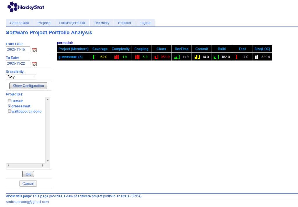
Here is a link to the ICU for the past 7 days. The coverage is about average but the complexity and the coupling are good. However the churn rate is really bad which means that we were constantly changing our source code and adding or deleting lines. the rest of the fields remain average. So over all the development for this project was good, however it seems that we tended to refactor our code very often.
The good:
I thought that at first the basic Wicket syntax such as the HTML tagging and the basic set up of the corresponding Wicket tags in the Java code was really easy to setup and were clearly defined. Also the WattDeopt commands to get the data were easy to figure out since we had previous experience writing code to get WattDepot data.
The bad:
Other than the basic set up of the tags and basic objects I found that Wicket was very hard to use. Throughout the project I found myself constantly thinking that JavaScript could do the same function, in less code and in an easier way to understand (or at least thats what I think). However in the end we were able to reason the framework out and complete the system.
System design:
I think that our system is very solid. We have all of the requirements fulfilled but we would have liked to put pictures that correspond to the carbon intensity level instead of merely listing the level. Also I believe that the system can be upgraded easily.
Teamwork:
I thought that our team worked very well in that we divided the tasks up and everyone did their part. Also if one of us got stuck we could ask the other members for help and get a greater incite to what we might have been doing wrong. Also often times if someone got stuck, the other members would stop and help look at the code and figure out a solution.
ICU:
Here is a link to the ICU for the past 7 days. The coverage is about average but the complexity and the coupling are good. However the churn rate is really bad which means that we were constantly changing our source code and adding or deleting lines. the rest of the fields remain average. So over all the development for this project was good, however it seems that we tended to refactor our code very often.
Monday, November 16, 2009
CLI Ver. 2.0
This assignment allowed us to take a look back at our version 1.0 code and take into account the reviews that were given by our classmates. From there we were able to implement the appropriate changes as well as use a revised library. Along with this revised library came 3 additional methods that were implemented to the end of our code. The newest distribution of the Eono system can be found here.
Version 2.0:
In this version we extended our code to meet the requirements in a better way. The first step was we implemented a different interface. Originally the interface had many method signatures, but in this design we made only one method signature (doCommand) available. Also we took the individual commands and made them into their own class. Lastly we implemented extensive testing as opposed to our last build where we only used the tests supplied in the example system.
Group meetings:
We would meet as often as we felt necessary which would be a couple times a week. In addition we would work individually and collaborate over instant messenger. Also we divided the work equally and I believe that the both of us each carried our own weight.
Software ICU:
The software ICU statistics suggest that our project is not healthy but at the same time not sick. We seem to be in between the two leaning more towards the healthy side.
Here are the statistics for Eono
According to the screen cast our coverage as well as the churn rate were unhealthy, but our complexity, coupling, DevTime, commit and build were all healthy. Also we since we created our test cases last, our test column value is unhealthy.
Questions:
All questions were answered by adding and additional test class and then changing the test class to meet the requirements of the questions. The test class will not be added to the final distribution of the system.
1. 2009-11-02T19:00:00.000-10:00 : 9.835E8
2. 2009-11-02T04:00:00.000-10:00 : 4.97E8
The above answers were found by starting a date at 2009-11-01T00:00:000-10:00 and ending at the end of the day. The time would be incremented by 1 hr in a loop and the largest or smallest value would be held in a counter and returned at the end.
3. highest: 2009-11-02 (monday) : 14764.0 MWh
4. lowest: 2009-11-07 (saturday) : 14089.0 MWh
The above was found by calculating the energyGenerate by the grid each day and the lowest/highest levels were kept and returned at the end.
5. highest: 2009-11-04 (wednesday) : 2.9959472E7 lbs
6. lowest: 2009-11-07 (saturday) : 2.2908808E7 lbs
The above was found by calculating the carbonGenerated by the grid each day and the lowest and highest values were kept and returned at the end.
Version 2.0:
In this version we extended our code to meet the requirements in a better way. The first step was we implemented a different interface. Originally the interface had many method signatures, but in this design we made only one method signature (doCommand) available. Also we took the individual commands and made them into their own class. Lastly we implemented extensive testing as opposed to our last build where we only used the tests supplied in the example system.
Group meetings:
We would meet as often as we felt necessary which would be a couple times a week. In addition we would work individually and collaborate over instant messenger. Also we divided the work equally and I believe that the both of us each carried our own weight.
Software ICU:
The software ICU statistics suggest that our project is not healthy but at the same time not sick. We seem to be in between the two leaning more towards the healthy side.
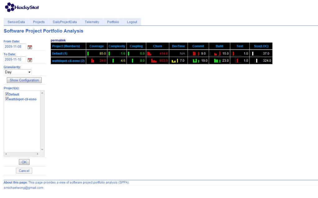
Here are the statistics for Eono
According to the screen cast our coverage as well as the churn rate were unhealthy, but our complexity, coupling, DevTime, commit and build were all healthy. Also we since we created our test cases last, our test column value is unhealthy.
Questions:
All questions were answered by adding and additional test class and then changing the test class to meet the requirements of the questions. The test class will not be added to the final distribution of the system.
1. 2009-11-02T19:00:00.000-10:00 : 9.835E8
2. 2009-11-02T04:00:00.000-10:00 : 4.97E8
The above answers were found by starting a date at 2009-11-01T00:00:000-10:00 and ending at the end of the day. The time would be incremented by 1 hr in a loop and the largest or smallest value would be held in a counter and returned at the end.
3. highest: 2009-11-02 (monday) : 14764.0 MWh
4. lowest: 2009-11-07 (saturday) : 14089.0 MWh
The above was found by calculating the energyGenerate by the grid each day and the lowest/highest levels were kept and returned at the end.
5. highest: 2009-11-04 (wednesday) : 2.9959472E7 lbs
6. lowest: 2009-11-07 (saturday) : 2.2908808E7 lbs
The above was found by calculating the carbonGenerated by the grid each day and the lowest and highest values were kept and returned at the end.
Subscribe to:
Posts (Atom)